![TW Blue Logo 230908a.png]](https://help.trakwell.ai/hs-fs/hubfs/TW%20Blue%20Logo%20230908a.png?width=126&height=17&name=TW%20Blue%20Logo%20230908a.png)
Sales Performance Statistics shows how well your stores and salespeople are turning customers into sales. Many of these reports work the same way, so once you learn Average Sale, the rest will feel familiar.
In this article
- Average Sale
- Monthly Statistics
- No Sale Report
- Revenue Per Opportunity
- Sale/Potential/NoSale
- Sales Conversion
- Sales Statistics (Emp)
- Sales Statistics (Loc)
- Total Sales
- Time With Customers
- Sales Vs. Opportunities
💡 Tip: Not sure what a term means? See 👉 Common terms.
Average Sale
Use Average Sale to see the average dollar amount per sale for your company, stores, or salespeople.
Cards
| Card | What it shows |
|---|---|
| Average Sale | Average dollar amount per sale |
| Total Sales | Total dollar amount sold |
| Closed Sales | Number of sales |
by Date
This tab shows the average sale for the dates you picked.
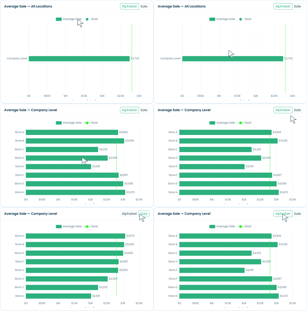
- Bar chart: shows the average sale for each location or salesperson. Click a bar to drill down, or use the Locations panel.
- Sort: use the Alphabet / Sale toggle to sort the bars by name or by amount.
- Goal line: the green dotted line is your company’s Average Sale Goal.
- Line chart: shows the average sale day by day. Drag the zoom slider below it to focus on a shorter period.
- Product category: use the filter at the bottom to see one product category at a time.
by Sales Staff Rank
This tab ranks your salespeople by average sale.
- Use the Name / Rank toggle to sort by name or by rank.
- The red dotted Chart Average line is the average of the salespeople shown, not your company goal.
- Hover over a bar to see the details.
You can print or subscribe to this tab.
by Monthly Comparison
Compare your average sale month by month across two years. See 👉 Monthly Comparison.
Monthly Statistics
Monthly Statistics is a table that shows a full set of numbers for each month of the year.
- Pick Employee Level to see each salesperson, or Location Level to see each store.
- Pick a year from the Year dropdown. It starts on the current year.
- Click Refresh to update the table.
The table includes opportunities, assigned, in process, sales, no sales, potential sales, sales conversion, total sales, adjusted sales, average sale, revenue per opportunity, prospecting %, Be Backs, excluded, reassigned, rejected, and the month. For what each one means, see 👉 Common terms.
📝 Note: This report doesn’t have Print or Subscribe buttons. To get it by email, use Actions > Subscription. See 👉 Working with tables.
No Sale Report
The No Sale Report lists every No Sale your salespeople submitted on the Floorboard. Pick your From and To dates to see them.
| Column | What it shows |
|---|---|
| No Sale Date | When the No Sale was submitted |
| Sales Person | Who submitted it |
| Location | The store |
| No Sale Stage | How far the customer got before leaving |
| No Sale Reason | Why the customer didn’t buy |
| Comment | Any note the salesperson added |
The Total row at the bottom shows how many No Sales are in the list. The table has the full set of tools, like search, filters, and download. See 👉 Working with tables.
Revenue Per Opportunity
Use Revenue Per Opportunity (RPO) to see how much you sell for every customer who walks in. It works like 👉 Average Sale, with these differences:
Cards
| Card | What it shows |
|---|---|
| Rev / Opportunity | Total sales divided by opportunities |
| Total Sales | Total dollar amount sold |
| Opportunities | Number of walk-ins |
by Date
- Sort: use the Alphabet / Revenue toggle.
- Goal and Average lines: the green dotted line is your company’s Revenue Per Opportunity Goal, and the red dotted line is the average. Click either one in the legend to hide or show it.
- Line chart: has its own Average line.
- There’s no Product category filter on this report.
💡 Tip: Hover over a bar to see the RPO, total sales, and opportunities together.
by Sales Staff Rank
Ranks salespeople by RPO, with an Average RPO line. Hover over a bar to see their RPO, total sales, and opportunities. You can print or subscribe to this tab.
by Monthly Comparison
Compare RPO month by month across two years. See 👉 Monthly Comparison.
Sale/Potential/NoSale
Use this report to see how your opportunities ended.
- The Opportunities card shows the total.
- Two stacked bar charts show the split: Percentage on the left and Count on the right.
- Colors: No Sale in red, Potential in light blue, and Sale in green.
- Click a bar on either chart to drill down, or use the Locations panel. Hover to see the numbers.
You can print or subscribe to this report.
Sales Conversion
Use Sales Conversion to see what percentage of opportunities turned into sales. It works like 👉 Average Sale, with these differences:
Cards
| Card | What it shows |
|---|---|
| Conversion | Percentage of opportunities that became sales |
| Sales | Number of sales |
| Opportunities | Number of walk-ins |
by Date
- Sort: use the Alphabet / Percent toggle.
- Goal and Average lines: the Goal line is your company’s Conversion Rate Goal %, shown with an Average line.
- Line chart: use the Chart / Report toggle to see the same data as a table.
- Product category: use the filter at the bottom to see one category at a time.
by Sales Staff Rank
Ranks salespeople by conversion. Use the Name / Rank toggle to sort. You can print this tab.
by Monthly Comparison
Compare conversion month by month across two years. See 👉 Monthly Comparison.
Sales Statistics (Emp)
Sales Statistics (Emp) is a table with a row for each salesperson at each store, plus an Unassigned row and a TOTAL row for every store. Pick your From and To dates to update it.
The table includes opportunities, sales, no sales, potential sales, sales conversion, total sales, adjusted sales, average sale, revenue per opportunity, Be Backs, excluded, reassigned, rejected, prospecting %, assigned, and in process. For what each one means, see 👉 Common terms.
📝 Note: If your account uses adjustments, credits, and returns, the table also shows the amount and count for each.
The table has the full set of tools, including Actions > Subscription. See 👉 Working with tables.
Sales Statistics (Loc)
Sales Statistics (Loc) is the same report as Sales Statistics (Emp), but it only shows one row per store plus a grand total. Use it when you want to compare stores without seeing each salesperson.
Total Sales
Use Total Sales to see how much you sold in dollars. It works like 👉 Average Sale, with these differences:
Cards
| Card | What it shows |
|---|---|
| Total Sales | Total dollar amount sold |
| Closed Sales | Number of sales |
| Opportunities | Number of walk-ins |
by Date
- Sort: use the Alphabet / Sales toggle.
- There’s no Goal line on this report.
- Line chart: use the Chart / Report toggle to see the same data as a table with Description, Date, and Total sales.
- Product category: use the filter at the bottom to see one category at a time.
by Sales Staff Rank
Ranks salespeople by total sales, with an Average line. Use the Name / Rank toggle to sort. You can print this tab.
by Monthly Comparison
Compare total sales month by month across two years. See 👉 Monthly Comparison.
Time With Customers
Use Time With Customers to see how long salespeople spend working with customers compared to waiting or doing other things.
Cards
| Card | What it shows |
|---|---|
| Time With Customers (min) | Total minutes spent with customers |
| Work Time (min) | Total minutes salespeople were working on the Floorboard |
| Waiting / Other (min) | Work time not spent with a customer |
| % With Customers | Percentage of work time spent with customers |
| Avg Time / Opportunity (min) | Average minutes spent with each customer |
| Opportunities | Number of opportunities included |
Tabs
| Tab | What it shows |
|---|---|
| by Average Time | Average minutes with each customer, by location or salesperson and by day |
| by Total Time | How work time splits between customers (blue) and waiting / other (orange), shown as percent and minutes |
On by Average Time, use All, Sales, Potential Sales, or No Sales to see one type of opportunity at a time.
How time is counted
- Time is based on the opportunities assigned to each salesperson and their status changes.
- Opportunities that were excluded aren’t counted. The chip above the charts shows how many were left out.
- If a salesperson works with more than one customer at the same time, the overlapping time counts once in by Total Time, but each customer counts separately in by Average Time.
💡 Tip: Click the ? icon next to the filters to see this explanation in the report.
The Locations panel opens to show salespeople under each store. You can print or subscribe to this report.
Sales Vs. Opportunities
Use Sales Vs. Opportunities to compare how many customers came in to how many bought.
Cards
| Card | What it shows |
|---|---|
| Closed Sales | Number of sales |
| Opportunities | Number of walk-ins |
| Total Sales | Total dollar amount sold |
by Date
- Click a bar to drill down. Hover to see opportunities, sales, and conversion %.
- The line chart shows the numbers day by day, with a zoom slider below it.
- Use the Product category filter to see one category at a time.
by Sales Staff Rank
Ranks salespeople by sales and by opportunities. Use the toggle to sort by Name, Rank (sales), or Rank (opportunities), and hover over a bar for details. You can print or subscribe to this tab.
Still have questions? Call or text us at 833-503-9934, email support@trakwell.ai, or submit a ticket.